Post-Analysis Paralysis? Your Guide to Actually Using Your Personal Color
You spent the time and money to get a professional personal color analysis. You walked out with a swatch card and a title like "Summer Mute" or "Autumn Deep." But the next morning, standing in front of your closet, you felt more confused than ever.
If your "perfect colors" feel like they belong to someone else, you aren't alone. Here is how to navigate the confusion and start using your palette with confidence.
1. Why the Result Might Feel "Off"
A personal color diagnosis is a snapshot in time, not a life sentence. Several variables can influence the result you received:
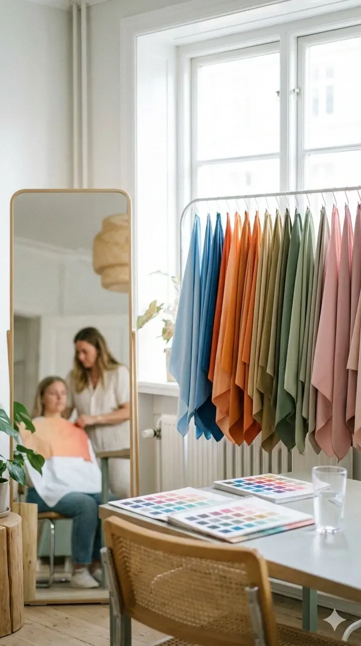
• Environmental Factors: Lighting is everything. If the studio used artificial lights that were too warm or too cool, it could skew the reflection on your skin.
• Skin Condition: If you were dealing with redness, a recent tan, or even lack of sleep on the day of your test, your skin’s "overtone" might have masked its true "undertone."
• Consultant Subjectivity: While there is a science to it, color analysis involves a degree of interpretation. Different consultants may prioritize different aspects of your appearance, such as your eyes versus your skin clarity.
• Key Takeaway: Your diagnosis is a compass, not a GPS. Use it as a general direction rather than a rigid set of rules.
2. Beyond the Season: The Power of Sub-Tones
The biggest mistake people make is thinking that everyone in the "Summer" or "Winter" category can wear the same colors. The magic happens in the sub-tones (Light, Bright, Mute, or Deep).
| Seasonal Type | Focus | Best Approach |
|---|---|---|
| Summer Light | High value, low saturation | Choose pale lavenders over vivid pinks. |
| Summer Mute | Grey-ish, soft tones | Opt for "dusty" colors like sage green or charcoal. |
| Autumn Warm | Earthy, rich tones | Look for terracotta, mustard, and olive. |
| Winter Deep | High contrast, dark tones | Think royal blue, emerald, and stark black/white. |
If a color within your season feels wrong, it’s likely because it doesn't match your specific chroma (vividness) or value (lightness/darkness).
3. A Practical Cheat Sheet for Daily Life
To stop the guesswork, focus on these three areas where color matters most:
• The "Face-Frame" Rule: The color of your top matters significantly more than your pants or skirt. If you love a color that "doesn't suit you," wear it as a bottom, a bag, or shoes. Keep your "power colors" closest to your face.
• The Makeup Anchor: Your lipstick and foundation are the most critical. If you are a Cool Tone, look for blue-based pinks or berries. If you are a Warm Tone, stick to corals, peaches, and warm reds.
• Hair Color Harmony: Your hair acts as a permanent background for your face.
- • Warm Tones: Gold brown, honey, or copper.
- • Cool Tones: Ash brown, plum, or silver-black.
4. Why Your Palette Changes Over Time
Personal color is not static. It can shift based on:
• Aging: As we age, our skin, hair, and eye pigment often lose intensity. A "Winter Bright" in their 20s might find they look better in "Summer Mute" tones in their 60s.
• Lifestyle Changes: Significant weight loss, changes in health, or even moving to a different climate (affecting sun exposure) can alter how colors interact with your complexion.
• Aesthetic Evolution: Your "vibe" matters. If your personality is bold and edgy, you might feel trapped in a "Soft Summer" palette. In that case, use your palette as a base and add high-contrast accents to match your energy.
5. Conclusion: You Are the Expert
The ultimate goal of personal color analysis is to make you feel empowered, not restricted. If you put on a "forbidden" color and you feel like a million dollars, wear it. The best way to learn is through experimentation. Take photos of yourself in different lighting wearing different colors. Often, the camera sees what our eyes miss. Your intuition and your mirror are more important than a swatch of fabric.